How To Create A Watercolor Palette For 12 Colors
Creating a palette seems easy as you begin with a limited amount of colors, but it becomes a lot more difficult as you compile a wide selection of watercolors. I remember creating my first palette was based on the first 12 colors I purchased. I also purchased the colors I thought were the most beautiful and didn't really give myself a reason as to why I was purchasing those colors. I quickly learned that I limited my palette with too many greens, only one yellow, a duochrome, and an Iridescent Gold. As you can tell, I didn't really grasp the concept of creating a palette that could be really practical. I couldn't take this palette with me and paint plein air. So, I set out to figure out the best palette for myself. I had to refer back to the color wheel and create something that could really get the best results and wide selection of colors from only 12 trays.
Here's what I learned to place into my limited palette with 12 trays, and what I've grown to love.
1. Earth (Yellow) - Raw Siena
2. Warm Yellow - Indian Yellow
3. Cool Yellow - Aureloin Yellow
4. Warm Red - Vermilion
5. Red - Cadmium Red
6. Cool Red - Alizarin Crimson
7. Warm Earth (Orange) - Burnt Siena
8. Cool Earth (Brown) - Raw Umber
9. Warm Blue (Purple) - Cobalt Blue Violet
10. Warm Blue - Ultramarine Blue
11. Warm Blue - Cobalt Blue
12. Cool Blue - Cerulean
What about green? – The beauty of this palette is you can mix the 3 blues and the 3 yellows to create 9 different shades of green. It's actually perfect for watercolor and gives you the type of results you'd want. As you mix and paint, the color never stays the same and they all begin to create a beautiful contrast to each other on the paper.
See All The Amazing Color Combos In Your Tray.
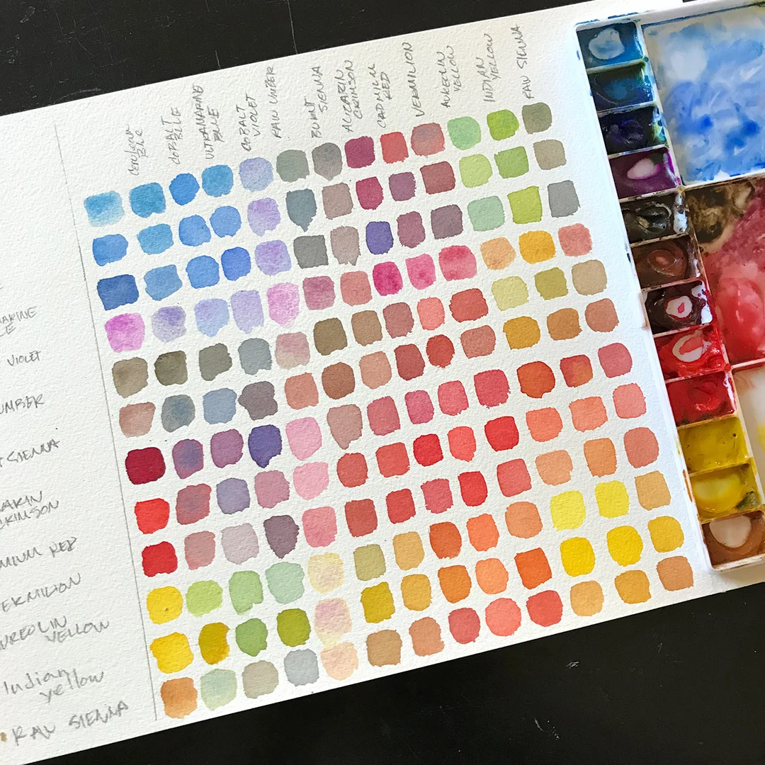
Creating a palette like this is very beneficial. All the different hues of primary and secondary colors will help in creating a wide selection of colors to use while you paint. To know exactly what colors you can create from the 12, it's helpful to make a 12x12 mixing chart.
What Is The 12x12 Mixing Chart? First off, it's very useful. I highly recommend you complete a mixing chart for any palette you create. Second, a mixing chart is a display of all your colors that are mixed with each other. You can create a mixing chart by creating 12x12 squares (144 total). Put your 12 colors listed on top and on the left side. You're basically creating a graph. Then begin mixing each color with the other color i.e., The first top color (Cerulean) with the first Left Side color (Cerulean) will give you (Cerulean); Then mix the second top color (Cobalt Blue) with the first Left Side color (Cerulean) and you'll get a mixed color of the two. Continue the first top row, mixing these colors and continue this process until you finish. Make you sure you clean your brush and tray between every mixture. You don't want a third color being combined while you mix. I know... It's very tedious, but the finished mixing chart will help you with every painting afterwards. *note: I created an extra column in the front that displays the single color, but you'll get same result as a diagonal.
The great part about learning and creating these palettes teach yourself to set boundaries when purchasing colors and witnessing how your colors collaborate with each other. It's very easy to fall victim to using only one color or mixing without knowing what the outcome will be. Also, the 12x12 is a helpful tool in preserving your watercolors beacause it allows you to check the chart to find the right mixture of paint for the particular color you seek.
From here, you can begin to create multiple palettes. You may find which colors you actually prefer as you paint. I've recently decided that I am going to change one of my 12 colors with a Paynes Gray.
What type of palette do you like? Is there a color palette I should try? Share an image or list of your palette with me!